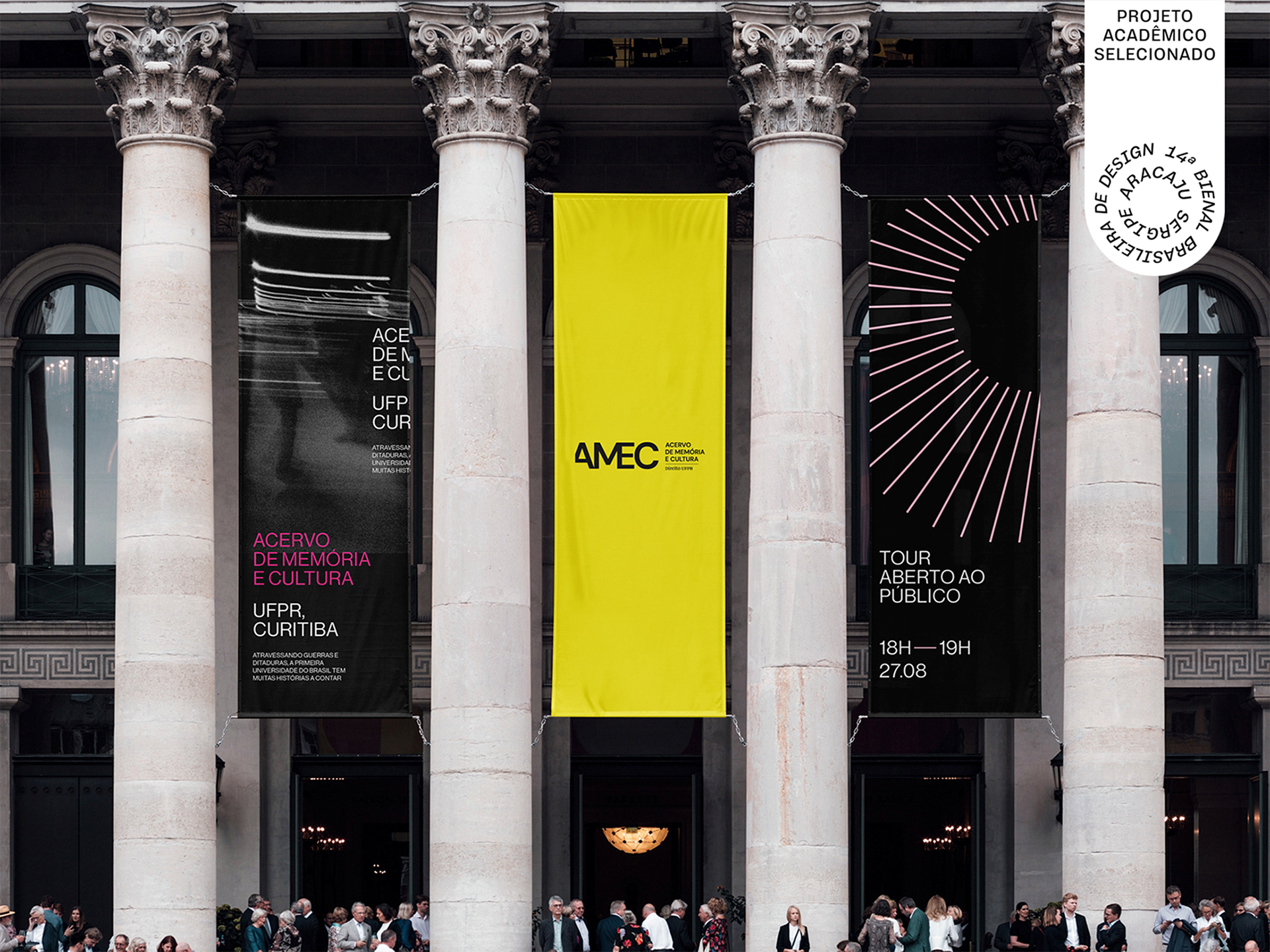
Project selected to be part of the Brazilian Design Biennial by ADG Brasil, in the Student category. For more information, visit the Biennial’s website through the link below:
AMEC emerged from the initiative to transform a vast collection, long forgotten, into a type of museum open to the public.
The Federal University of Paraná is the oldest university in Brazil. Having endured wars and dictatorships, its building holds over one hundred years of history much of which was hidden away in the university’s basements. Paintings, documents, books, and artifacts made up this extensive historical collection that had been left in the dark. Professor Dr. Thiago Hansen was the creator of the project, which sought to give new meaning to these materials and, through them, tell the story of the city of Curitiba from a new perspective.
This vast collection includes documents addressing relevant themes such as the military dictatorship, the first women and Black individuals to study at UFPR, and renowned artists and writers who began their journeys at the university among them, Paulo Leminski.
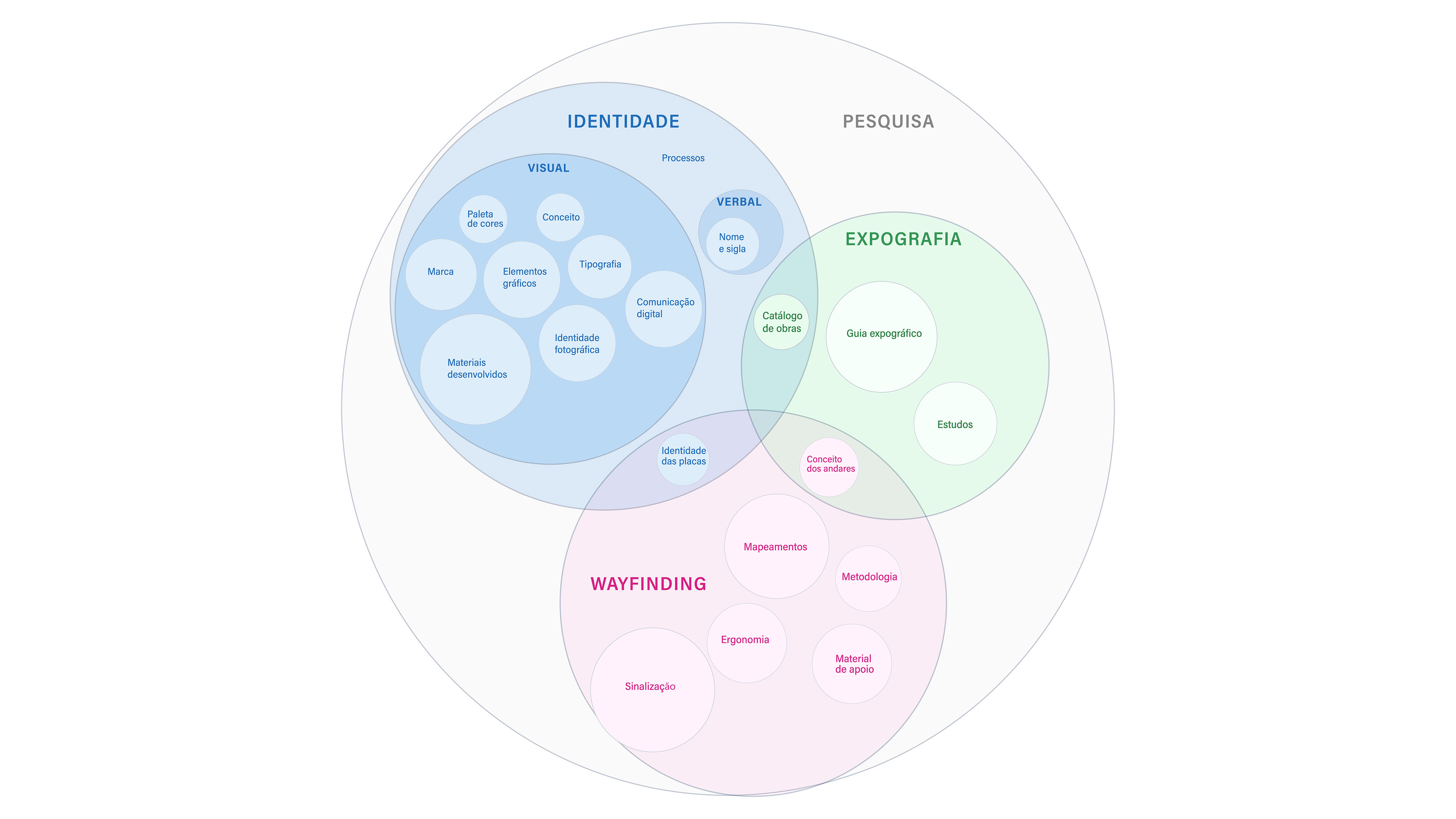
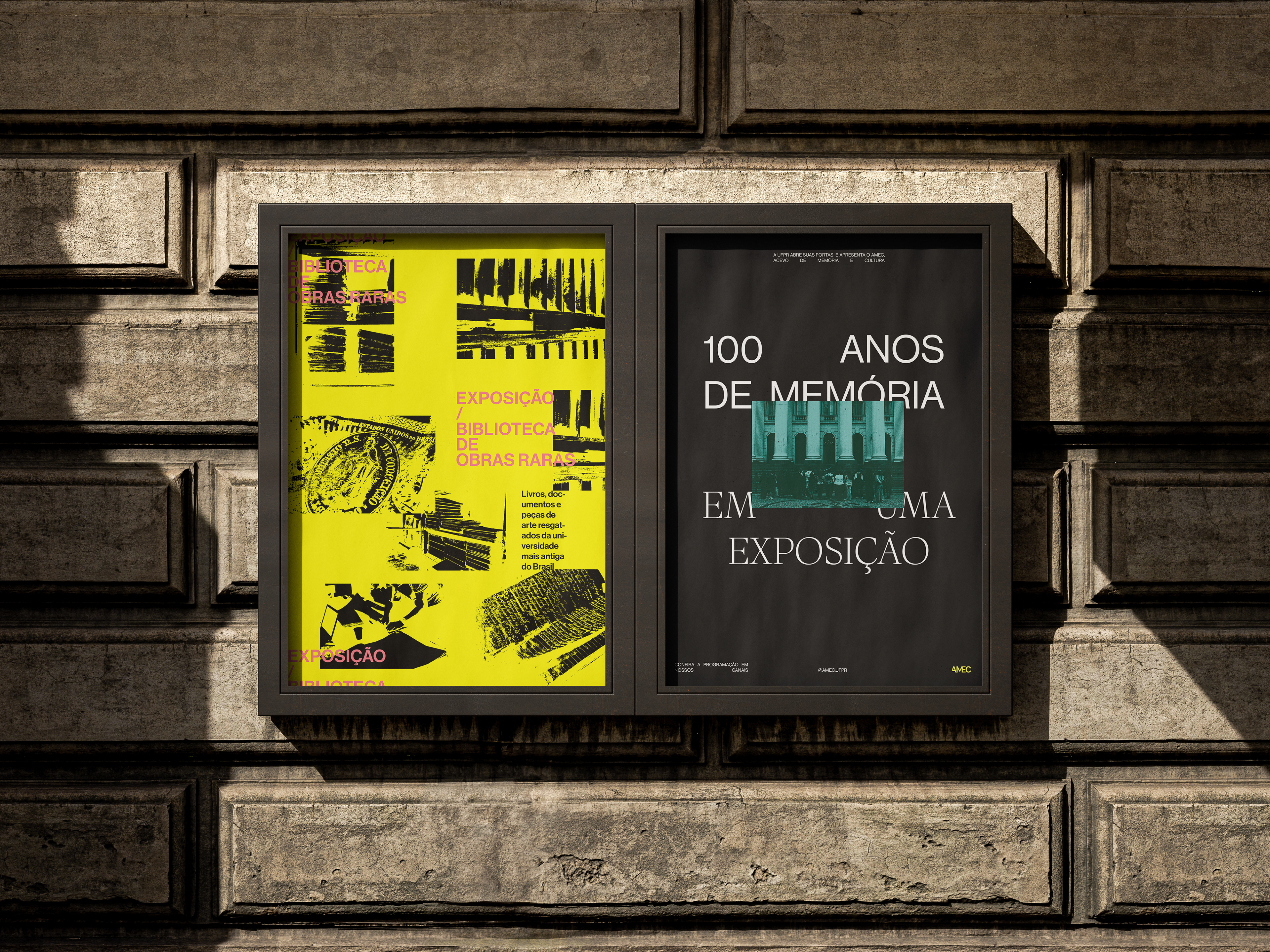
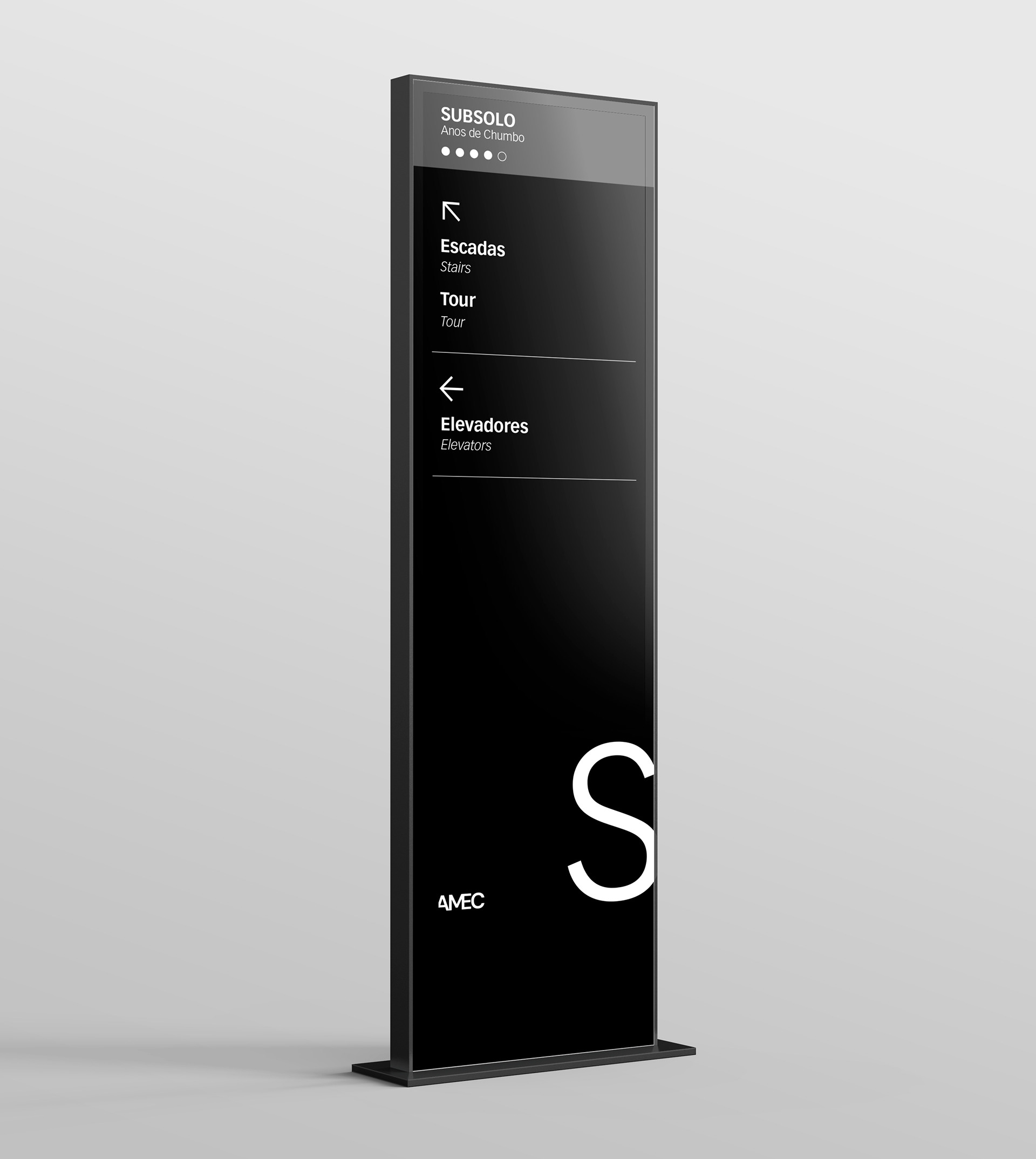
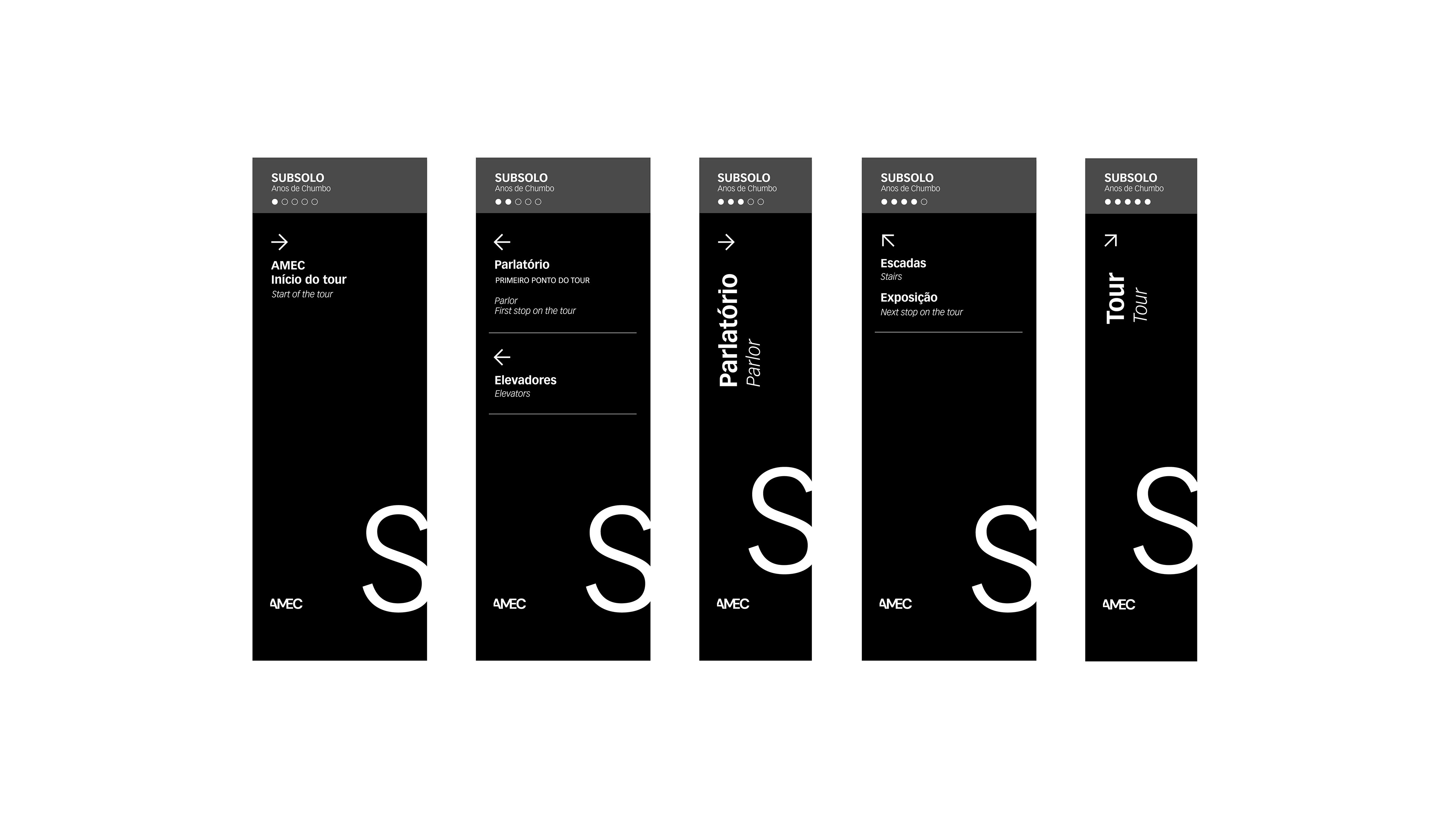
Amid all this, the major challenge faced by the team was to give this museum a name and an identity, as well as to design a signage system that would allow visitors to navigate a complex building, and an exhibition concept for the works on display.
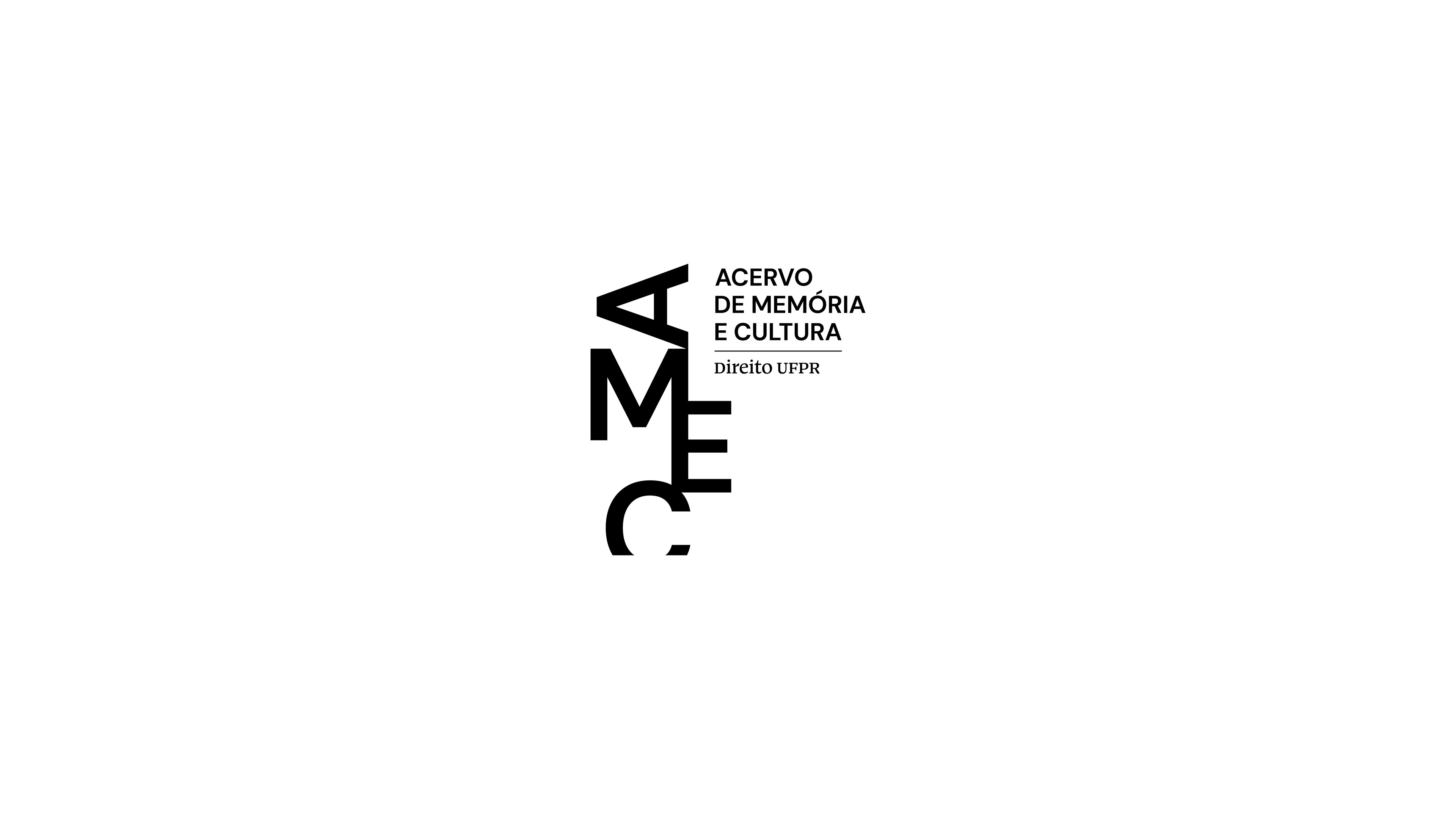
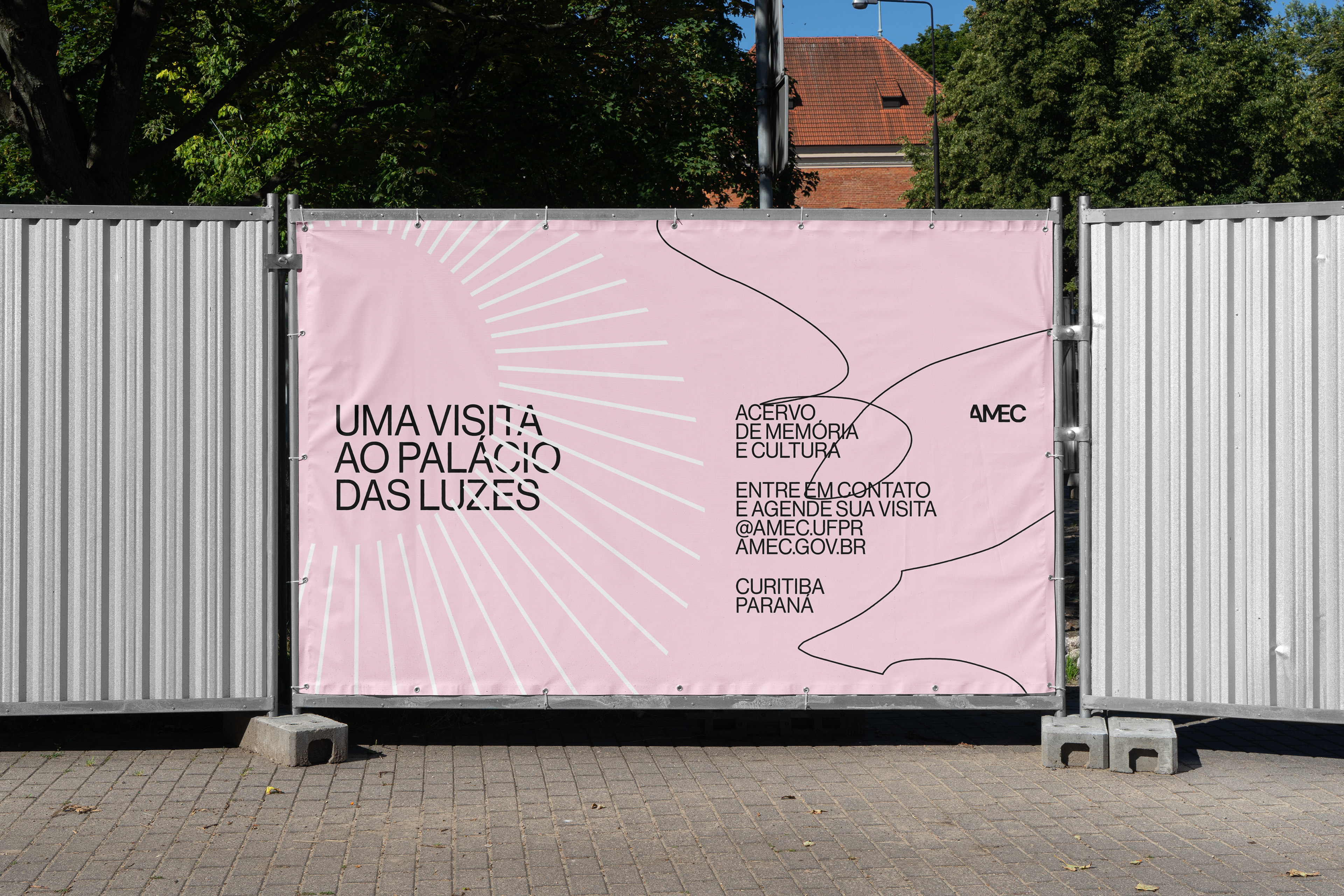
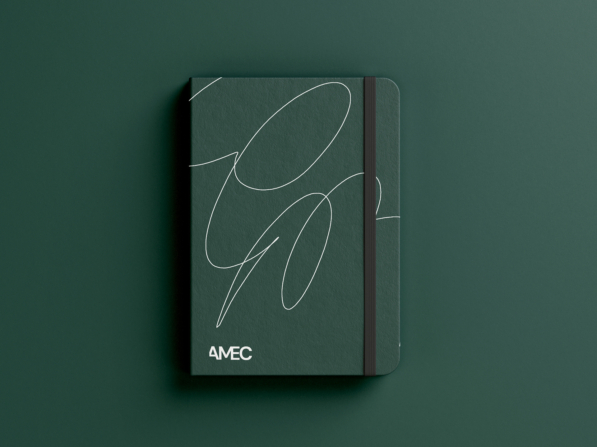
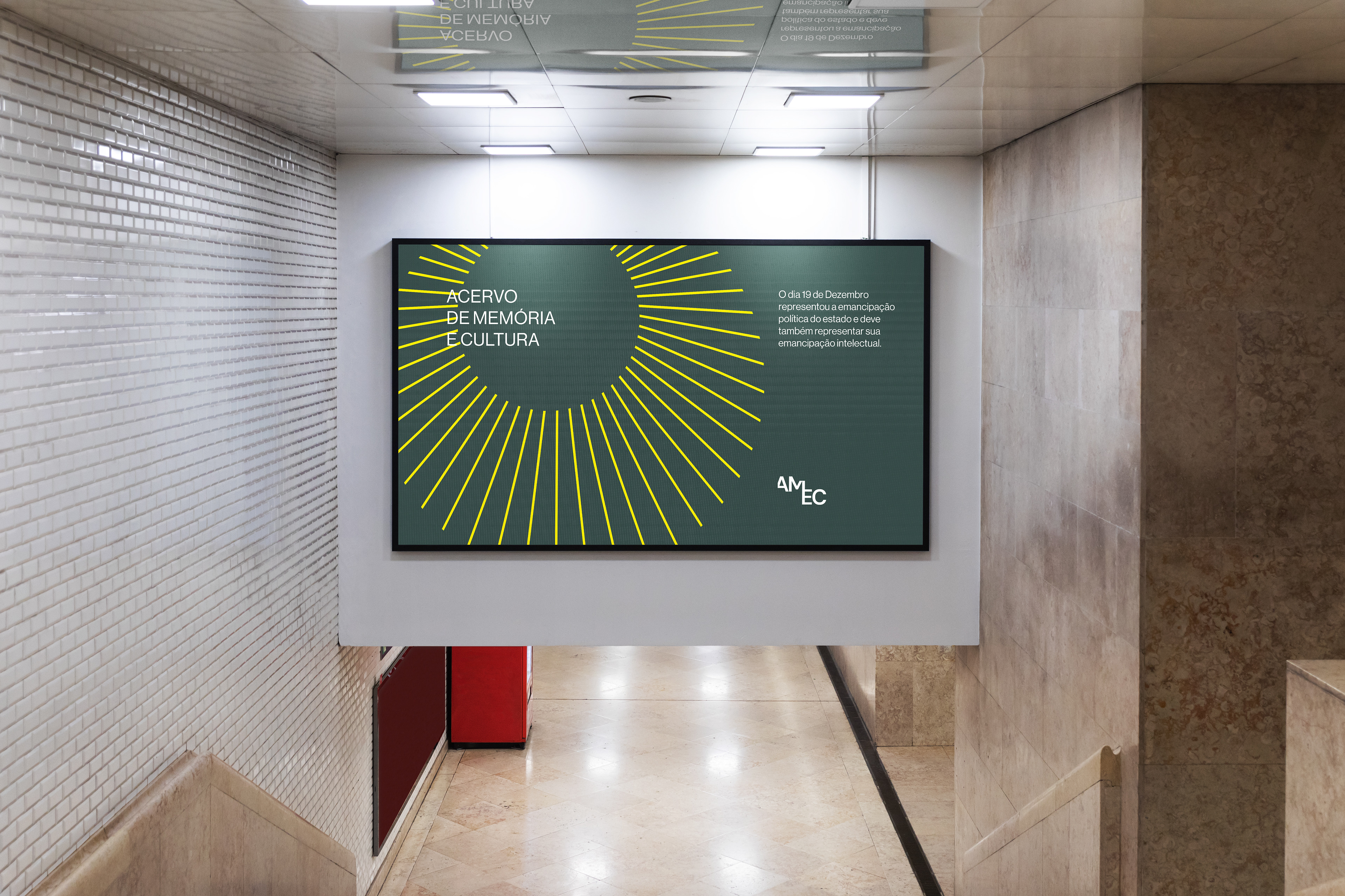
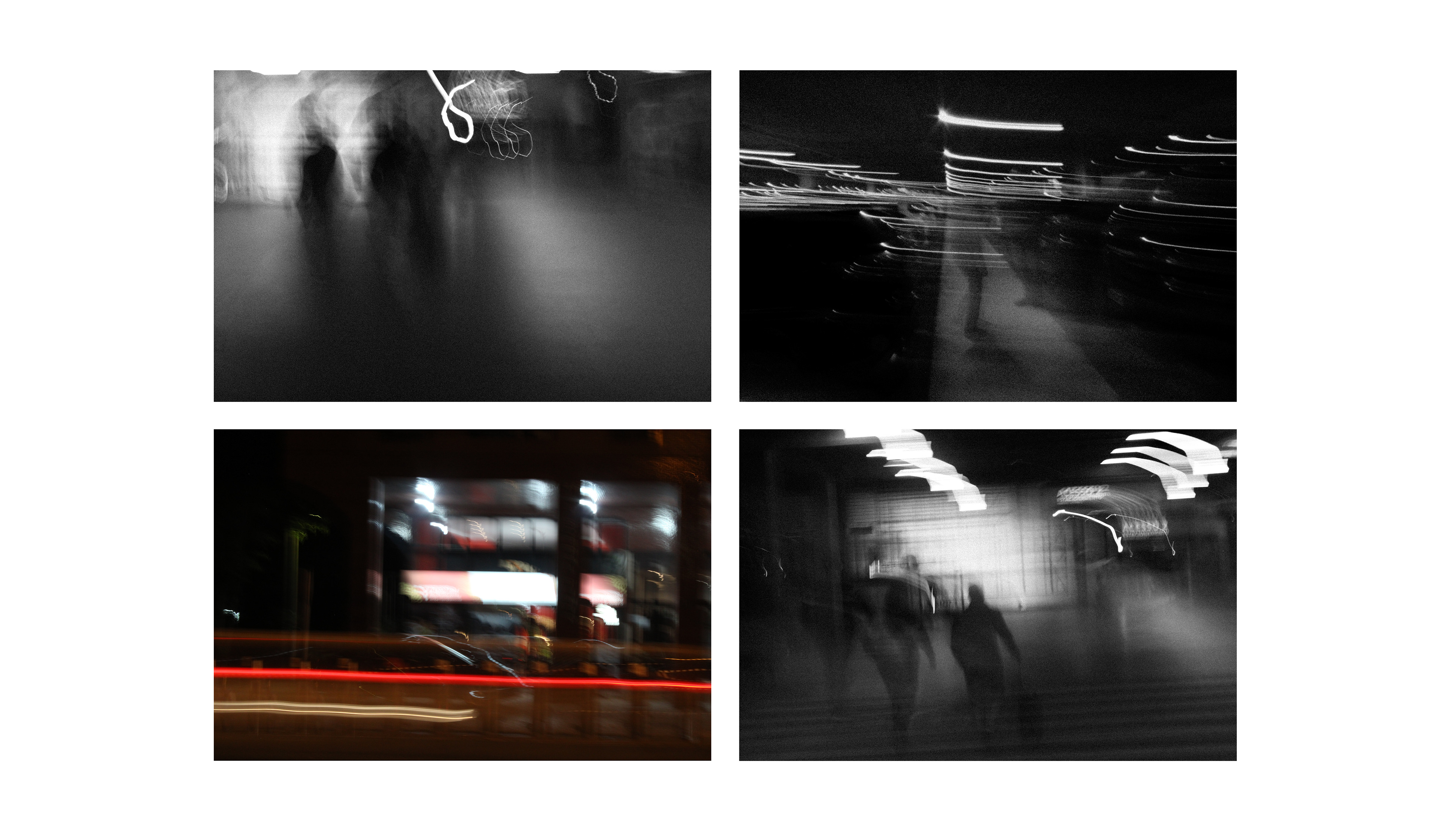
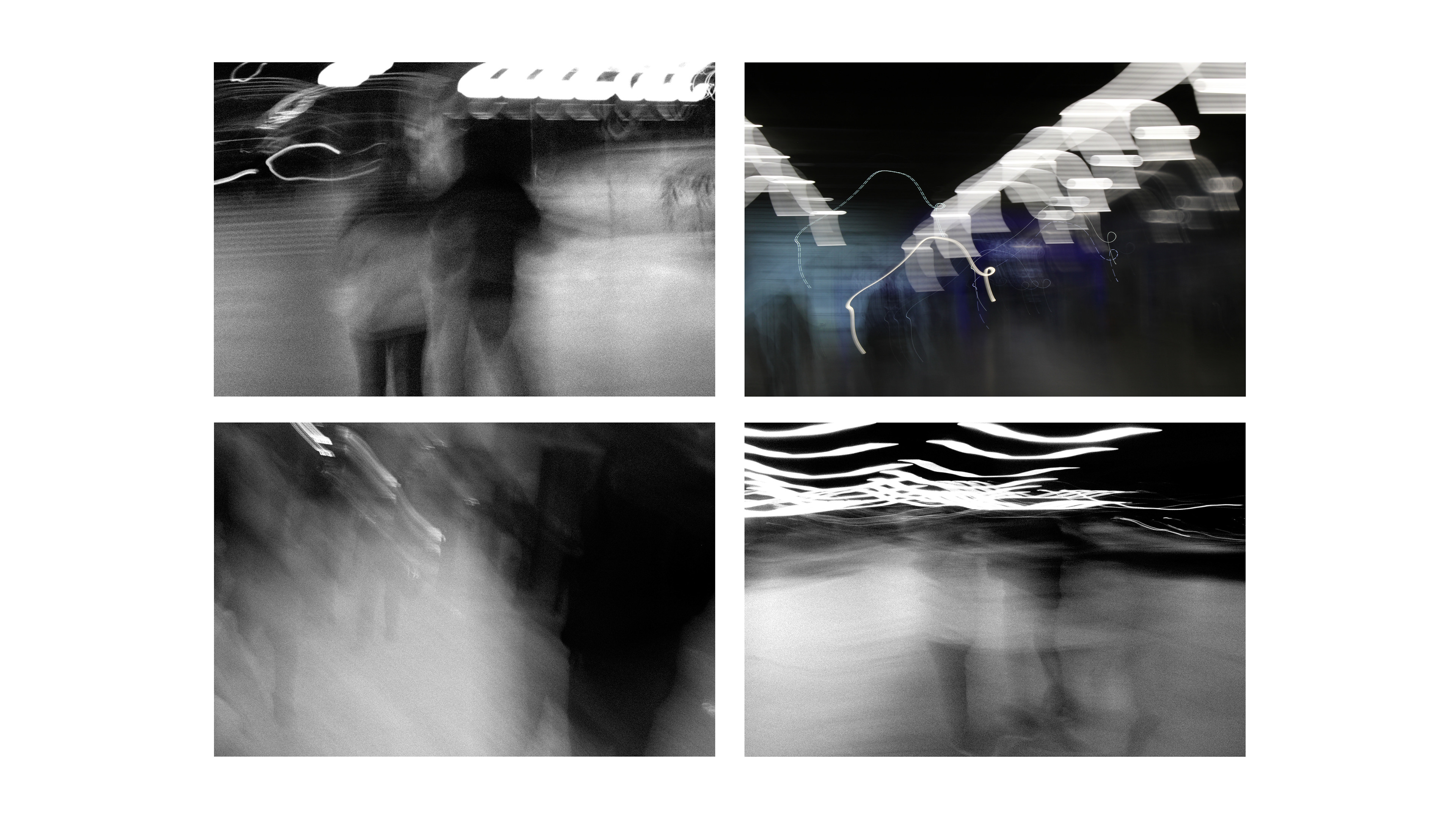
The concept developed was based on how we can perceive and translate memory visually. Letters with faded sections and blurred photographs were some of the visual resources used to represent how an image formed by memory can manifest in the mind, thus emphasizing the historical nature of the project one that revives forgotten memories. Scribbles and linework were also used as graphic elements, referencing the “confused” or abstract characteristics through which memory can appear. A variable logo embodies the idea that an image shaped by memory does not need to have a single correct form it can be mutable.
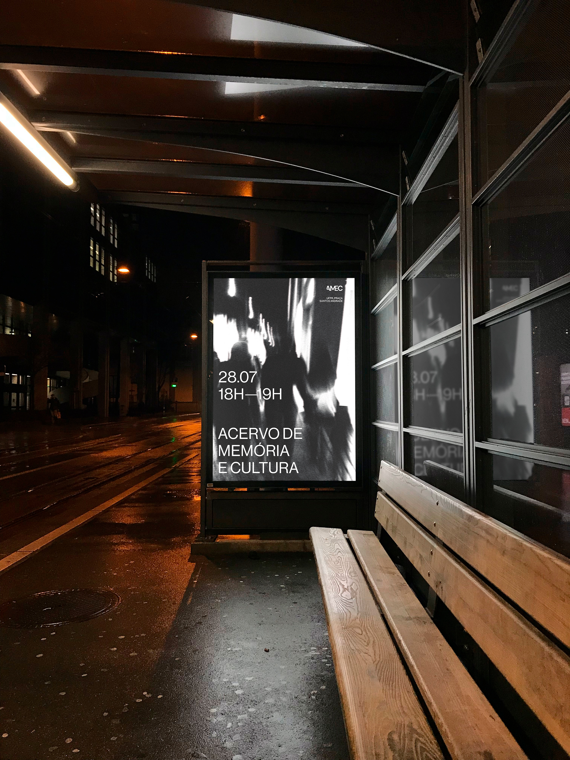
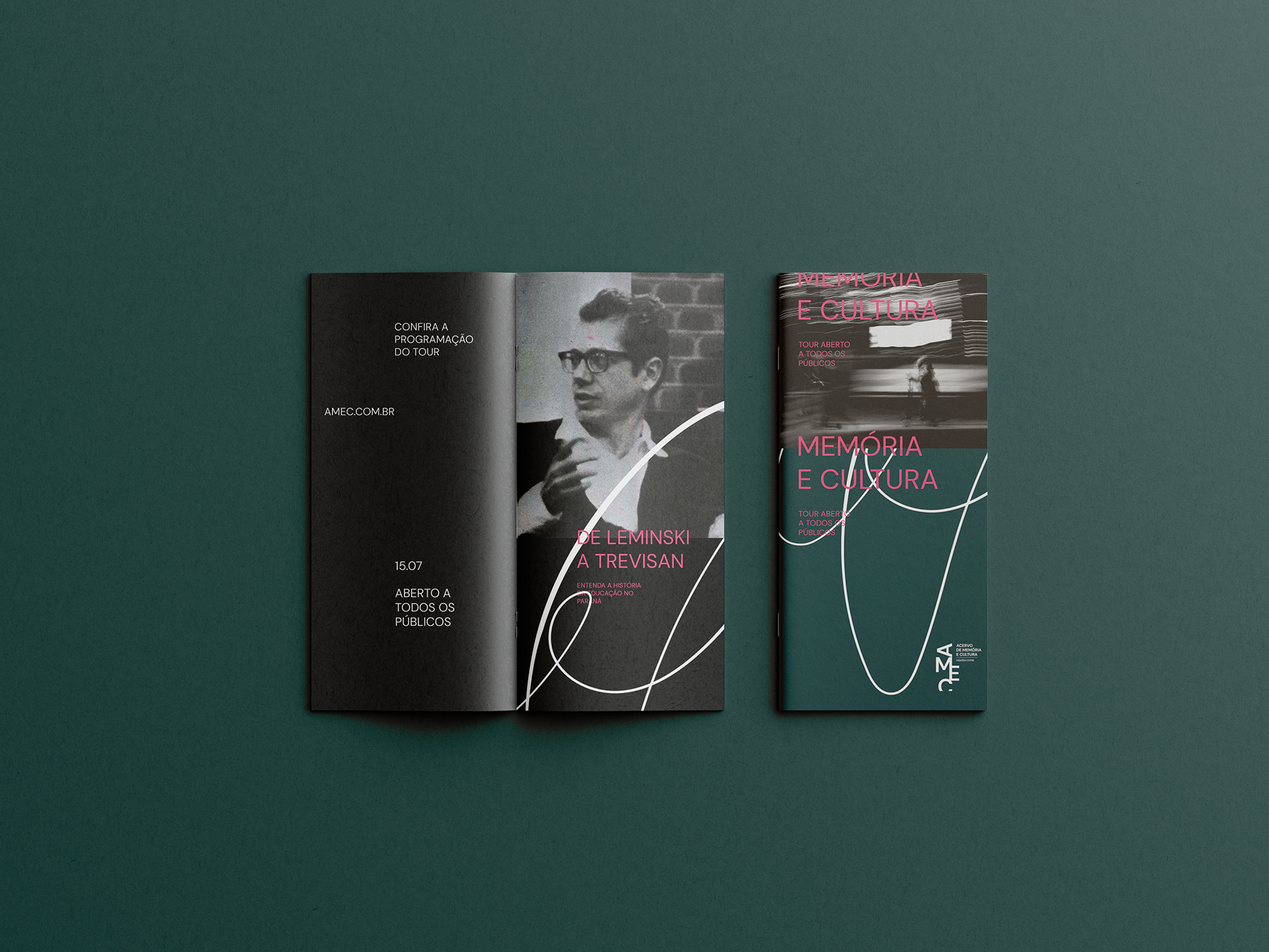
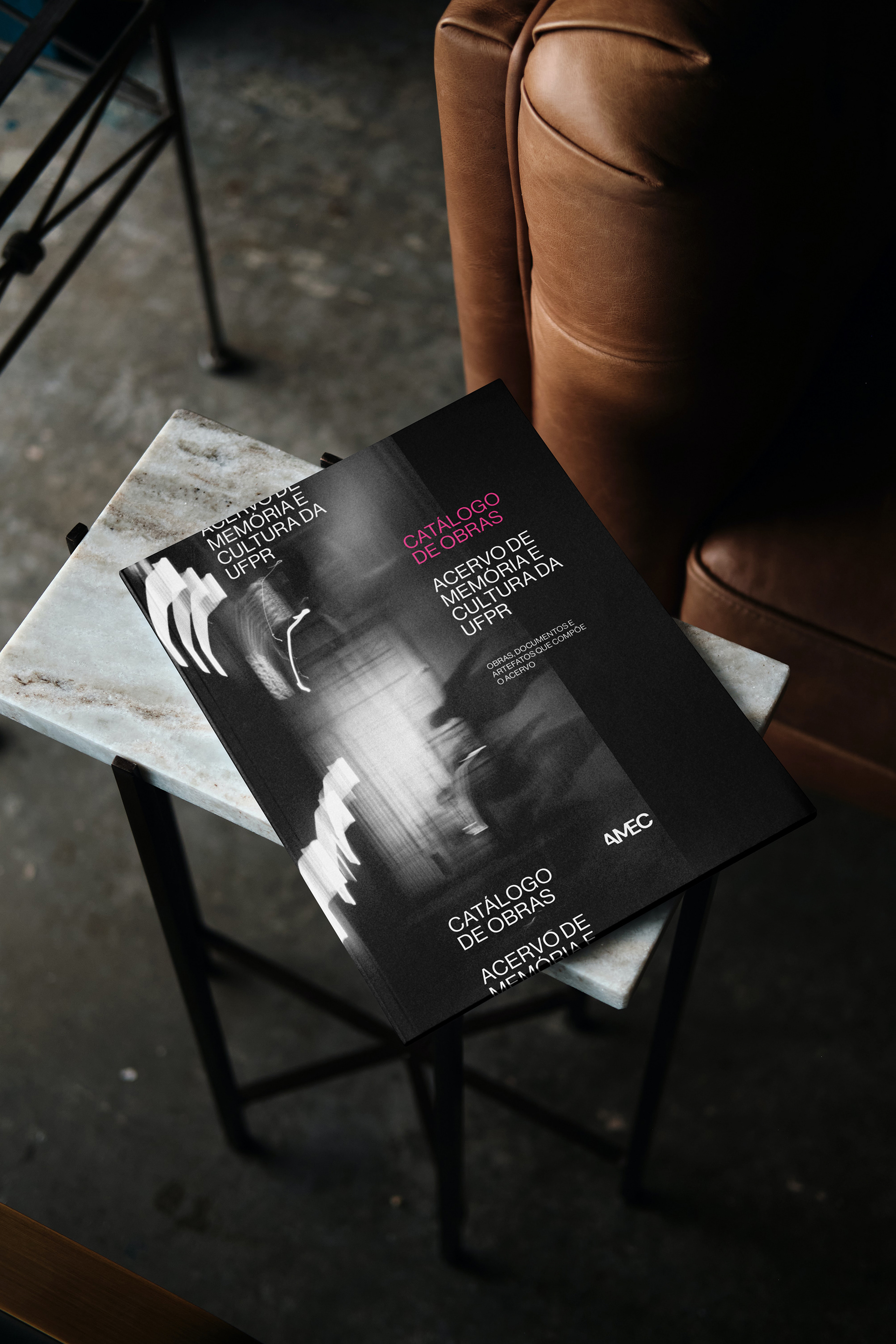
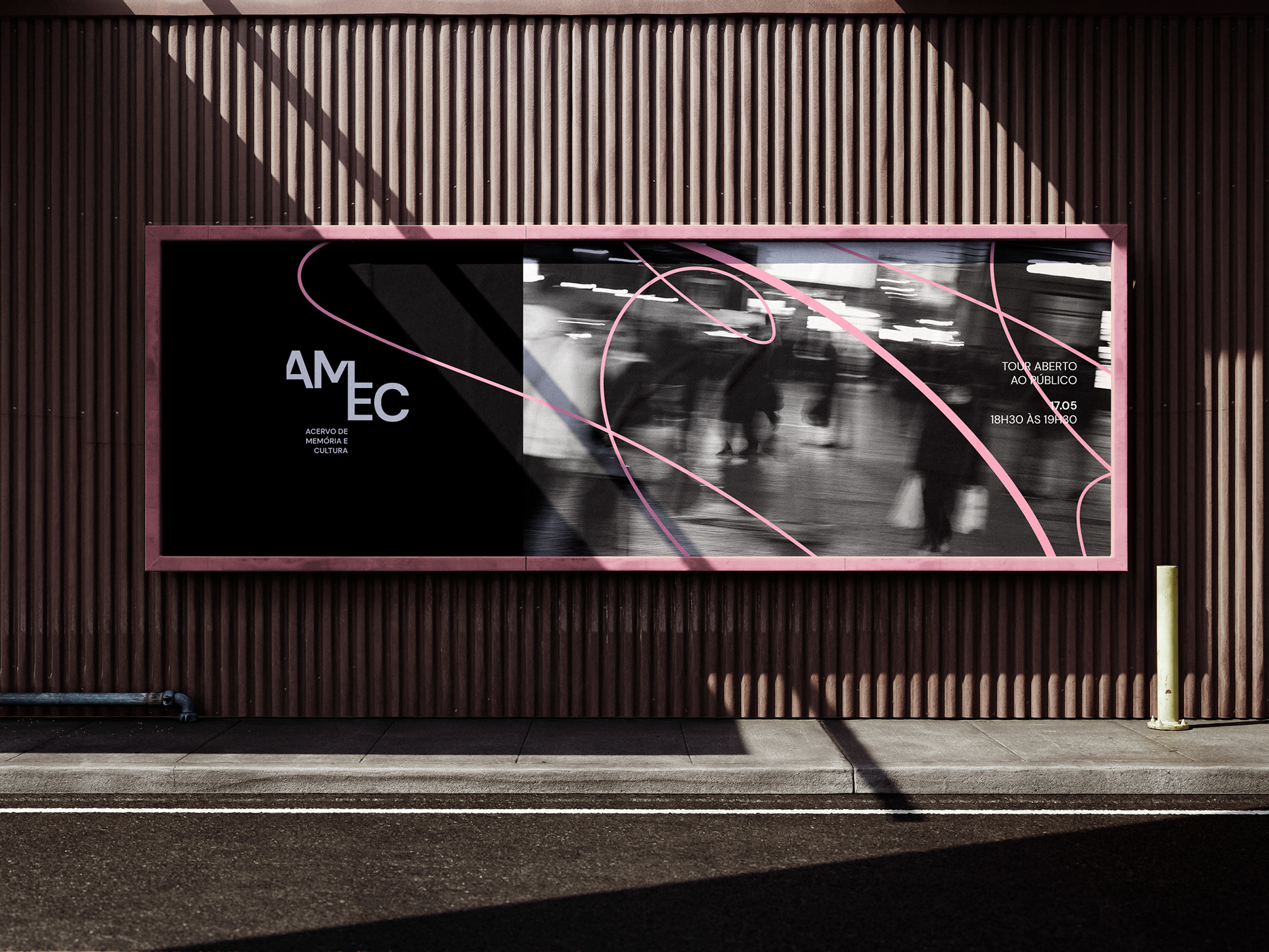
A series of photographs was produced within the developed concept, intended for use in the brand’s materials. Using long-exposure techniques, it was possible to capture images that contribute to the brand’s visual universe, featuring abstract forms and reinforcing the concept of memory.
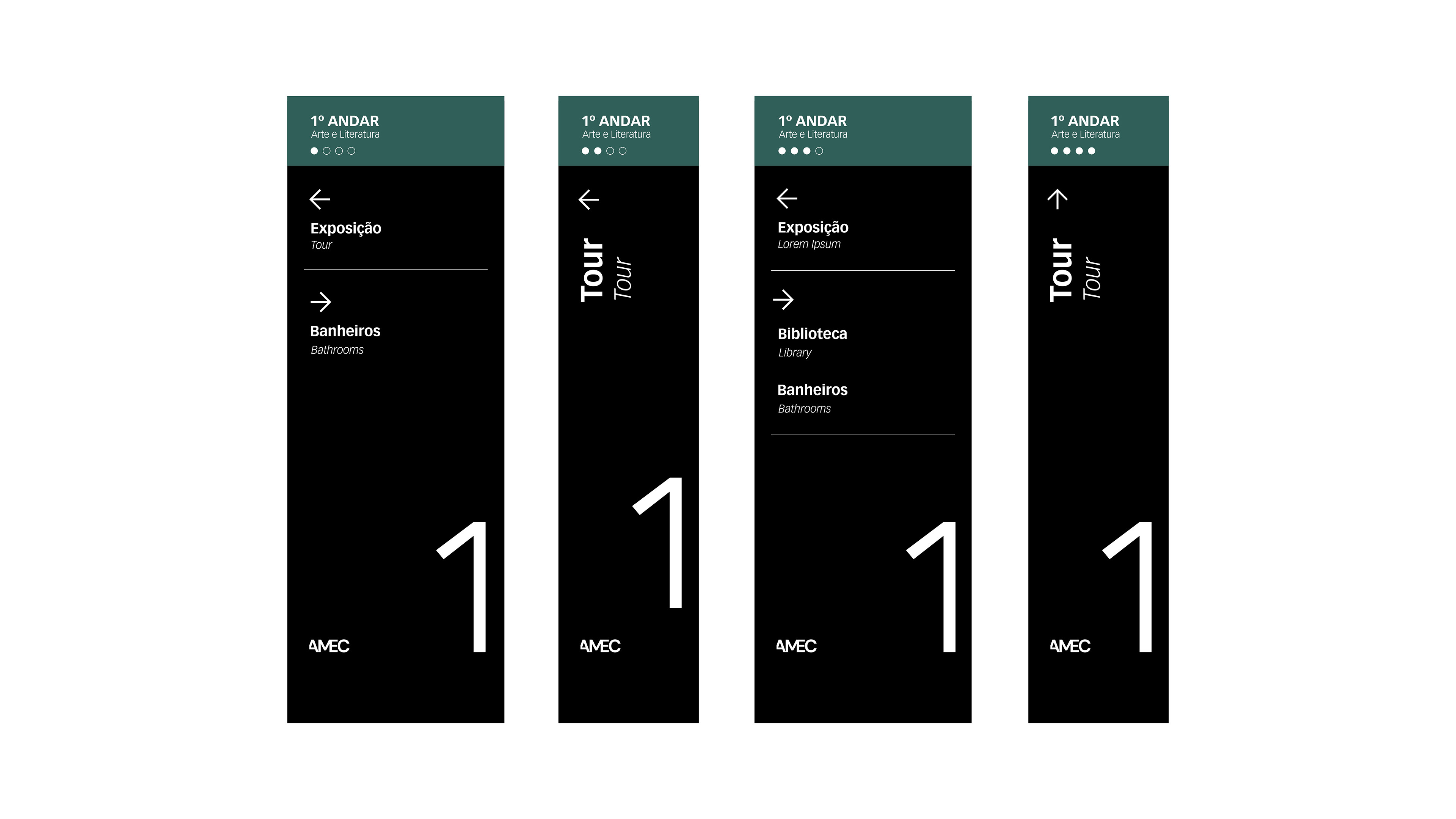
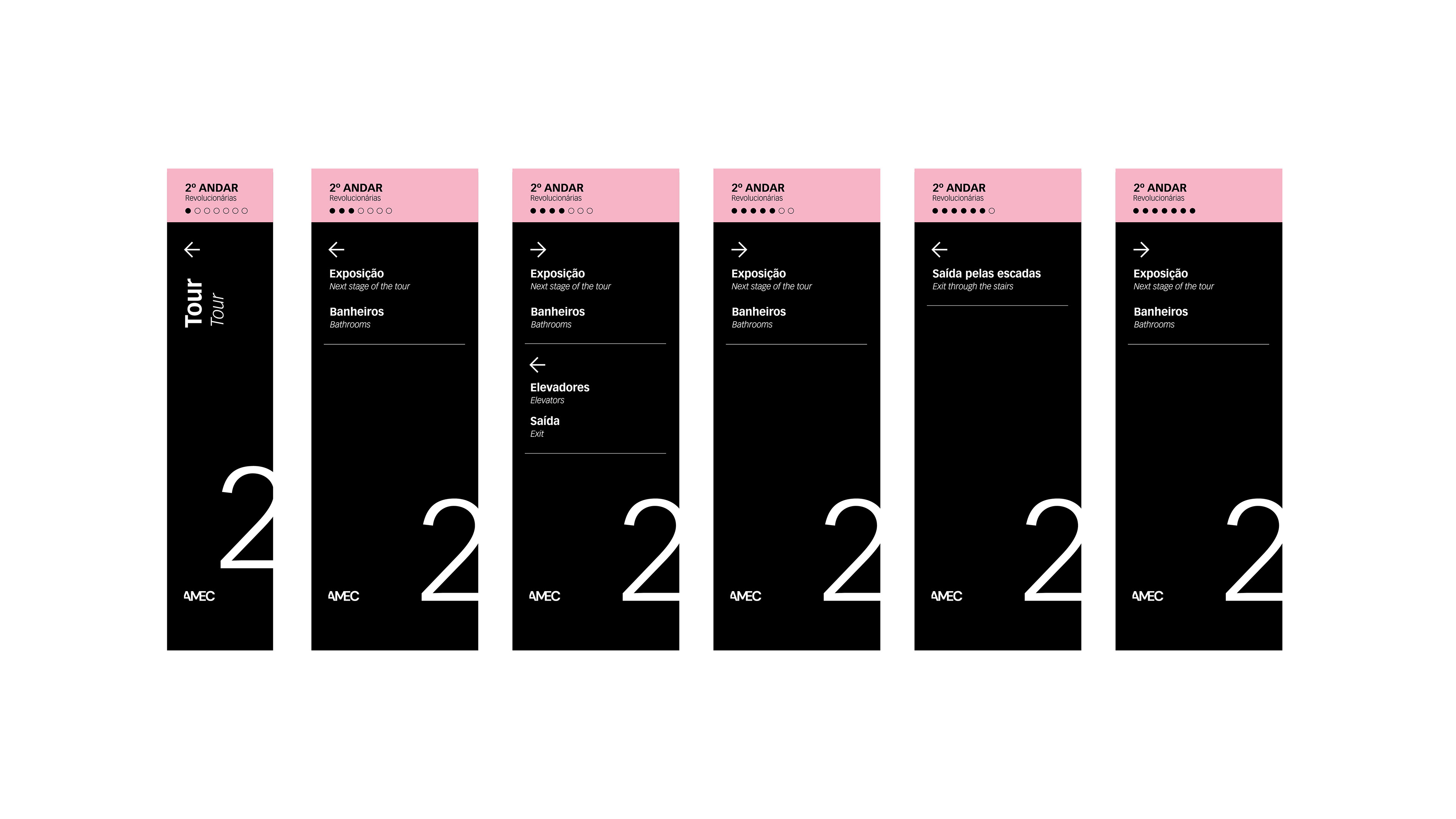
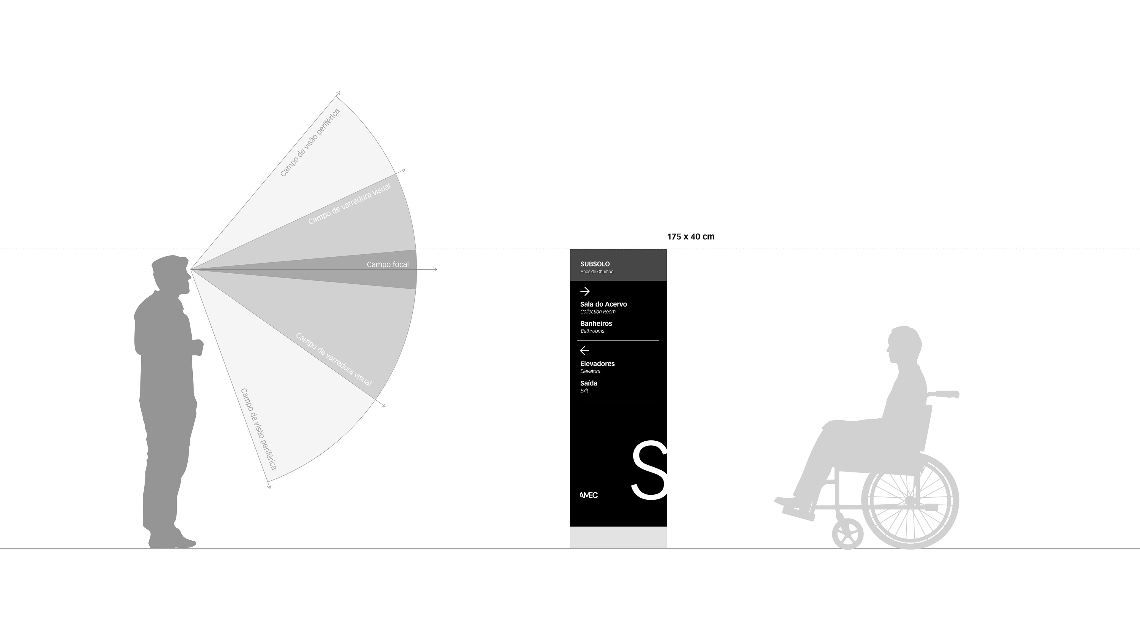
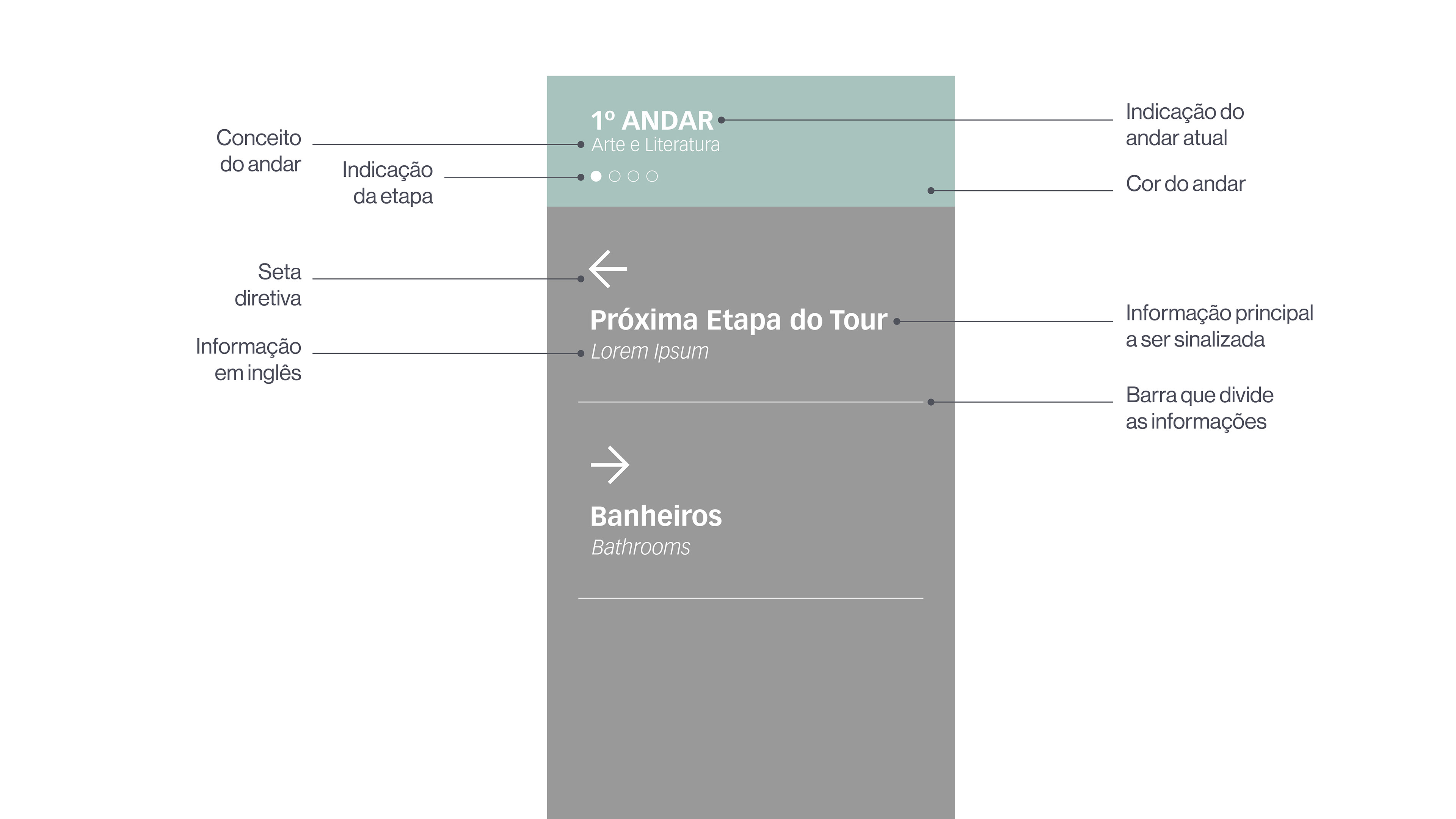
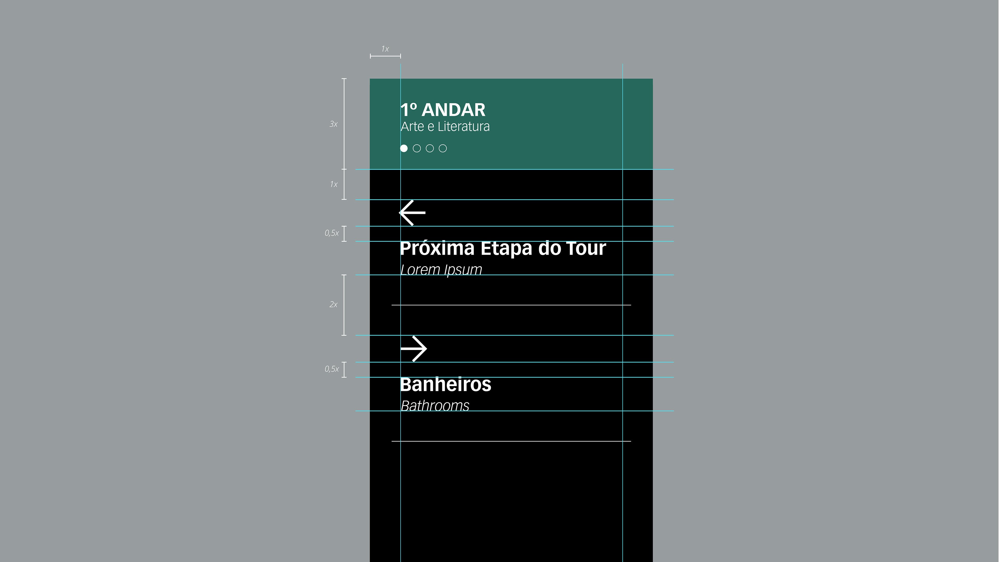
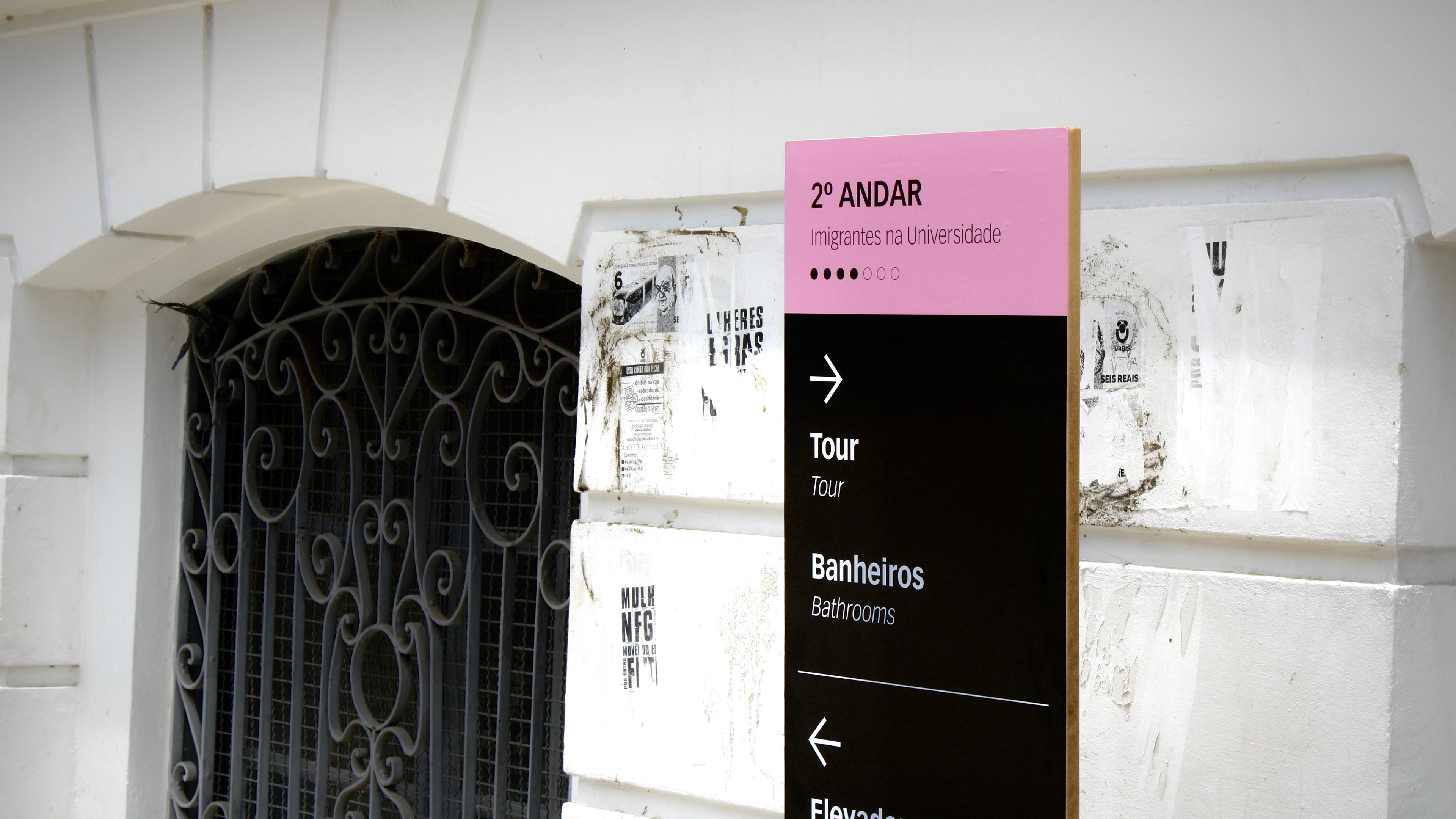
Within the signage project, the identity was applied in a more subtle manner, prioritizing information design principles to facilitate orientation and circulation, given that the UFPR building is a complex environment.
The floors were differentiated by color to make the information easier to understand, and each floor was assigned a name/concept corresponding to the stories and works displayed there.
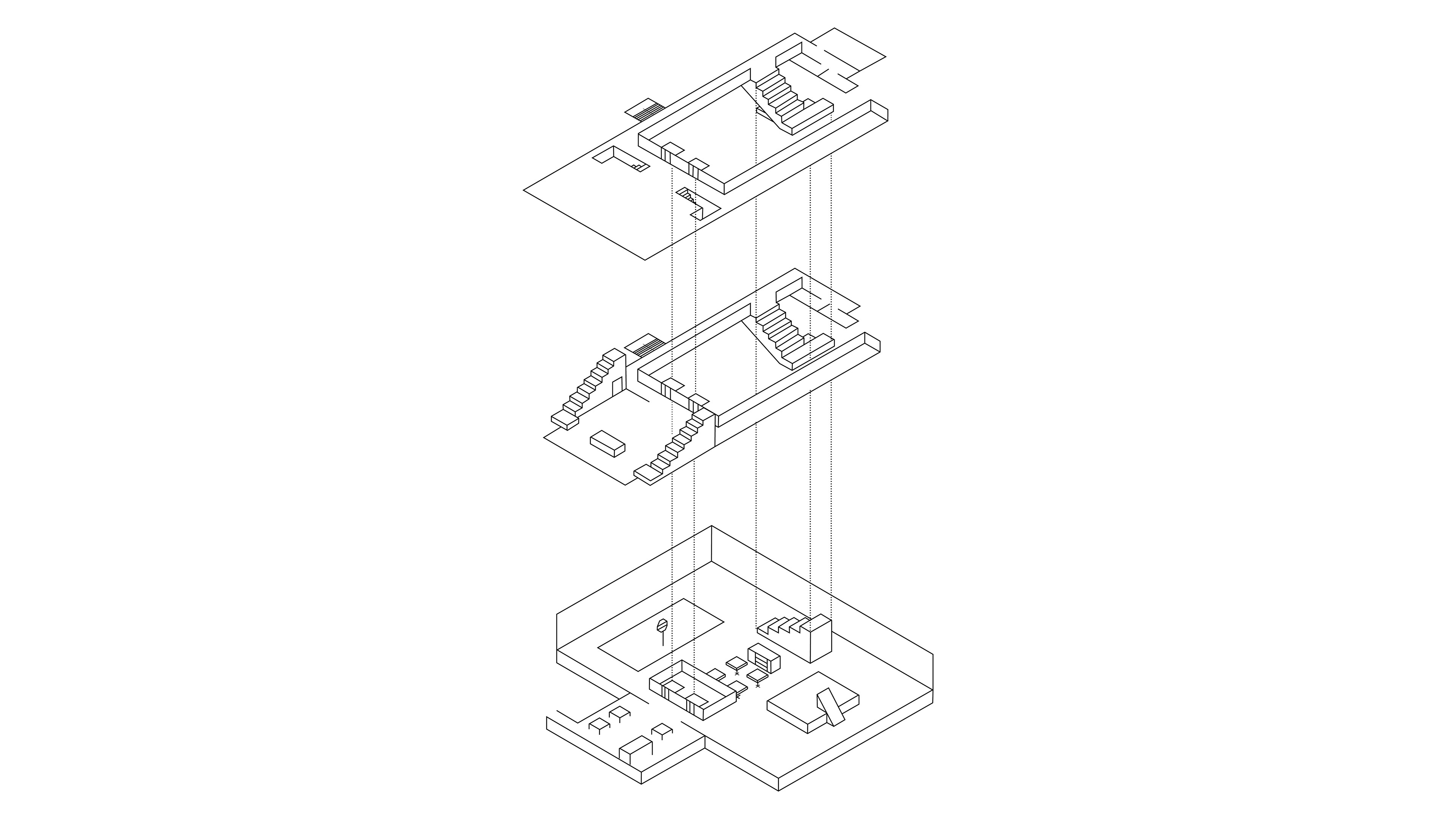
An isometric map of the three floors was also created to further assist with navigation and movement within the building.
To provide a better understanding of the Tour route, the building’s interior areas were mapped, highlighting the most distinctive elements on each floor. The isometric map is featured in the brochure, a material to be handed to visitors at the beginning of the tour, facilitating their orientation and understanding of the building’s layout.